TL;DR
- Problem:
- Beginners struggle with navigation complexity, unclear lesson structures, and inconsistent visual patterns.
- Role:
- UX/UI design, prototyping, iterative wireframing
- Tools:
- HTML/CSS, user testing, responsive design
- Timeline:
- 7 versions (v10–v17, skipping v15) with iterative refinement
- Key Decisions:
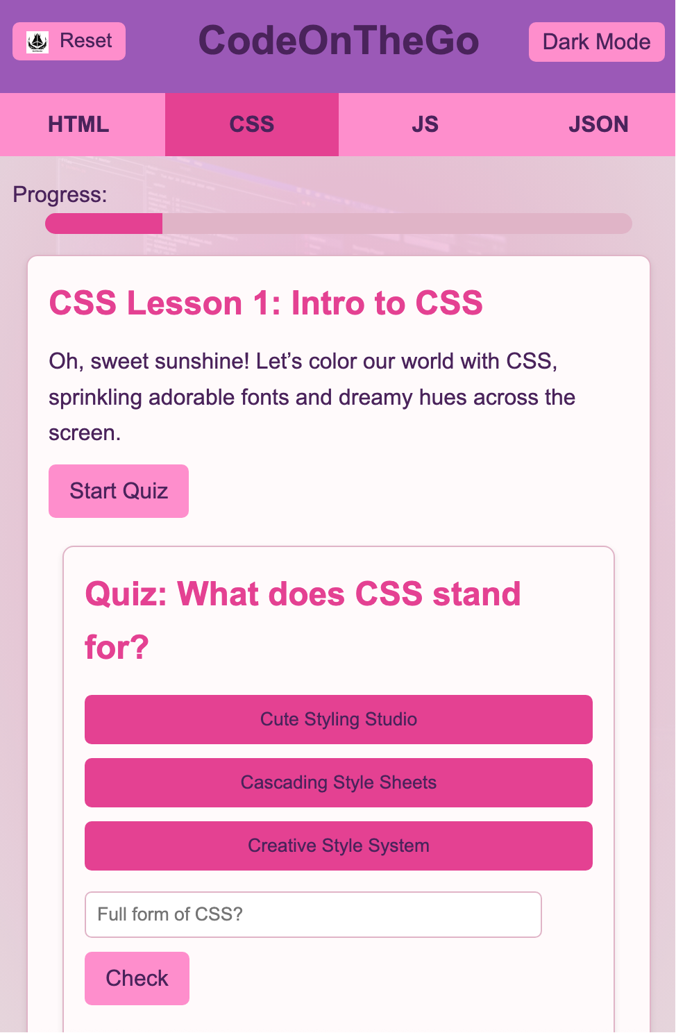
- Card-based interface, hierarchical nav (Home → Course → Lesson), single-column mobile layout
- Result:
- Improved confidence in navigation and lesson discovery; clearer pathways through content.
Problem / Context
Beginners learning to code often struggle with navigation complexity, unclear lesson structures, and inconsistent visual patterns. This project explored how to create an intuitive learning environment that reduces cognitive load while maintaining clear pathways through programming content.
Audience
Adults and young learners new to programming, seeking structured lessons with clear progress tracking and easy navigation between topics and skill levels.
Goals
- Create a clear visual hierarchy that distinguishes courses, lessons, and content types.
- Enable quick scanning and resumption of lessons across devices.
- Maintain consistency in navigation patterns and card-based layouts.
- Eliminate scroll-jacking and custom scroll regions for better accessibility.
- Support seamless mobile-first responsive behavior.
Constraints
No backend or authentication system; fully static HTML/CSS prototype. All interactions must work without JavaScript frameworks, and navigation must feel natural on touch devices.
Design Decisions
- Card-based interface with consistent spacing and visual weight across all screens.
- Hierarchical navigation: Home → Course → Lesson → Content, with clear back/up patterns.
- High-contrast typography and reduced color palette for focus and readability.
- Single-column mobile layout that stacks naturally without breakpoint complexity.
- Progress indicators and breadcrumb patterns to maintain context.
Iteration / Versions (v10–v17)
Early versions (v10–v12) tested different navigation models and card sizes. Mid iterations (v13–v14, v16) refined spacing, typography scale, and interaction feedback. V17 is the final version with tightened mobile responsiveness and polished card hierarchy. A separate App Store presentation page was created as a showcase for v17.
Testing & Validation
- Tested with beginner users unfamiliar with coding platforms.
- Observed navigation patterns: users preferred visible "back" over hamburger menus.
- Verified touch target sizes and scroll behavior on mobile devices.
- Confirmed that lesson cards supported fast scanning and selection.
Outcome + Next Steps
The v17 prototype demonstrates a scalable, accessible learning structure. Feedback indicated improved confidence in navigation and lesson discovery. Future work includes adding search/filter functionality, user accounts for progress tracking, and interactive code editors within lessons.