TL;DR
- Problem:
- Users don't understand how their content is collected, processed, and shared on social platforms.
- Role:
- UX research, interaction design, wireframing
- Tools:
- HTML/CSS prototyping, user interviews, usability testing
- Timeline:
- 7 versions over multiple iterations
- Key Decisions:
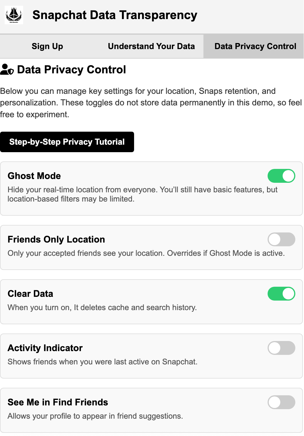
- Progressive disclosure, high-contrast cards, plain language verbs (Collect / Process / Share / Control)
- Result:
- Users navigated the flow more confidently and gave clearer answers about data movement.
Rationale / Problem
Users rarely understand how their content is collected, processed, and shared once posted on social platforms. Snapchat's existing privacy documentation was buried in legal text. This project aimed to surface that information in the app itself, using plain language and visual flows users could navigate on their own terms.
Research & User Needs
- Interviewed users about their mental model of "where does my Story go after I post it?"
- Most assumed content stayed local or was only visible to friends; few understood server-side processing or third-party access.
- Users wanted answers but didn't want to read long policy documents or leave the app.
- Key insight: people trust apps more when they can see data flow, even if the flow is complex.
Visual Research & Inspiration
Studied data flow diagrams, privacy dashboards (Apple, Google), and step-by-step explainers (Duolingo onboarding, government forms). Focused on high-contrast cards, short sentences, and clear action verbs like "Collect," "Analyze," "Share," "Control."
Wireframe Development (v3–v7)
- v3: Initial card layout with three-step flow. Too dense; users skipped text blocks.
- v4: Split steps into separate screens with "Next" buttons. Improved focus but felt like a tutorial users wanted to skip.
- v5: Introduced progressive disclosure: tap a card to expand details. Reduced perceived length.
- v6: Added inline icons and color coding (amber for "processing," blue for "user control"). Improved scannability.
- v7: Final refinement: tightened copy, increased touch targets, ensured mobile-first responsive behavior, added a "Download My Data" link.
Design Decisions
- Mapped a simple story: Collect → Process → Share → Control.
- Used high-contrast typography and direct labels instead of abstract icons alone.
- No hidden sticky UI or scroll-jacking that blocks screen readers.
- Kept interactions lightweight and accessible without requiring JavaScript libraries.
Testing & Validation
- Test prompt: "Show me what happens to your Story after you post it."
- Users navigated the flow more confidently in v7 than in earlier versions.
- Fewer wrong taps, clearer answers, and increased willingness to explore privacy settings.
Outcome & Next Steps
The v7 prototype demonstrated that privacy information can live inside the app without overwhelming users. Next steps include adding a plain-language glossary, integrating the flow into Snapchat's existing settings menu, and providing a one-tap "Download My Data" option.